slide deck

CLIENT-READY PITCH DECK

Full rebrand condensed into a slide deck, including product description, changes, design choices, styles, merchandise, and marketing campaign.

what is oishii yasai?
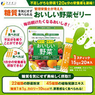
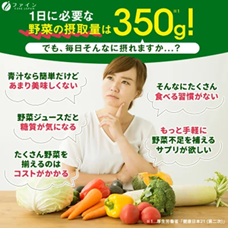
oishii yasai flyer
oishii yasai flyer
oishii yasai flyer

OISHII YASAI (DELICIOUS VEGETABLES)

FINE Japan Co. Ltd.

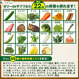
“Delicious Vegetables” is a Japanese Dietary Supplement in the form of a jelly stick, and is well known product among Japan's society as a health product. It is manufactured by FINE Japan Co. Ltd., and the product is under their line of supplement jellies called “Supplement Jellies”.

Sold as an affordable commodity, it is packed with the nutritional benefits of one meal's worth of vegetables (120g), meeting the guidelines set by the Ministry of Health in Japan. 22 different kinds of vegetables and 45 vegetable extracts, with only 1g of sugar per stick; they are diet-friendly, and the individually packed sticks make them easy to carry around and eat at any time.

WHY REBRAND?

JAPANESE-ONLY PACKAGING

  • Hinders opportunities for a newer, non-Japanese customer base being in a foreign market

LAYOUT & COMMUNICATION

  • Colour inconsistencies and too much un-readable text for non-Japanese speakers
  • Key features of product not communicated to foreign customer base clearly

PRICE & BRAND IMAGE

  • Due to shipping and other fees, product is being sold at 3x the original price
  • Price increase drives a need to change the target customer base and the way the product is marketed
  • Movement of product off shelves currently only relies on customers who are already familiar with the product -> Strong brand presence in Japan however not carried over to foreign markets

process

NEW BIG IDEA

From everyday commodity to simplified nutrition.

  • The expensive price prevents this product from living up to being an “affordable everyday commodity”
  • Adjusted the messaging to be a product that is convenient and premium
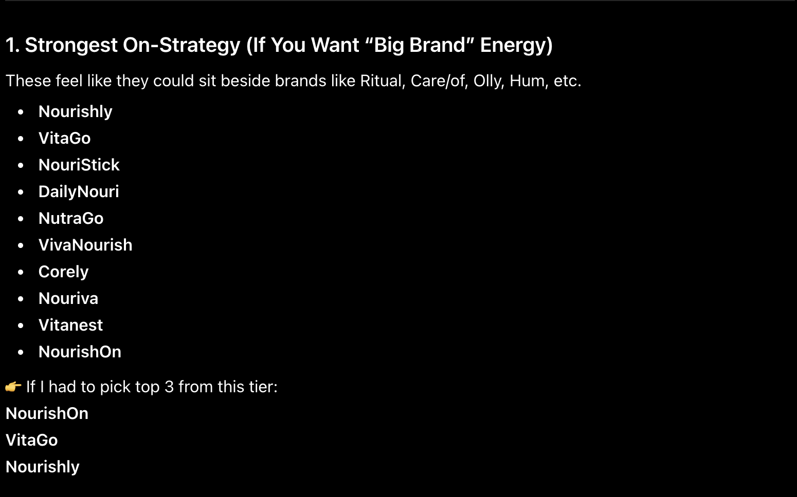
Using ChatGPT to aid in name generation

Prompt: This product, currently called "oishii yasai" おいしい野菜 is not built for the western market, and the literal translation is "delicious vegetables" which sounds unnatural and doesn't work. Give me some new name ideas that constitute to it's functional use and brand image.

IDEATION

  • 'Delicious Vegetables' as a direct translation for a brand name was not memorable enough
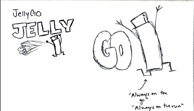
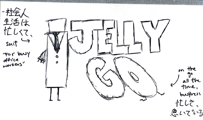
  • Brainstorming with and without AI, I wanted to come up with a brand name that encapsulated the products special characteristic, being a supplement in the form of a jelly, and convenience
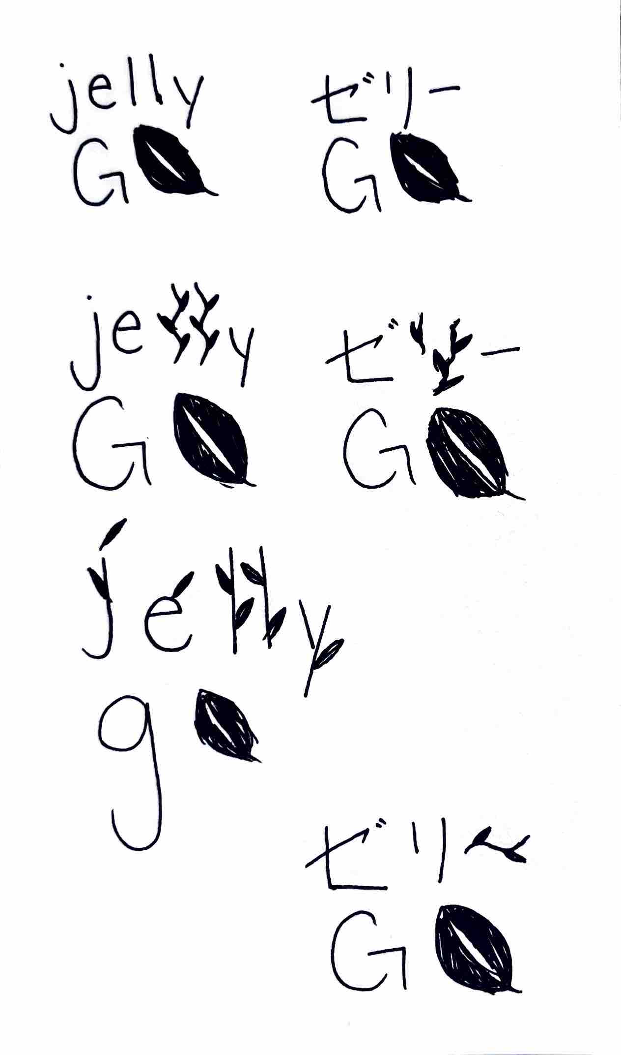
logo sketch logo sketch
logo-sketch

LOGO

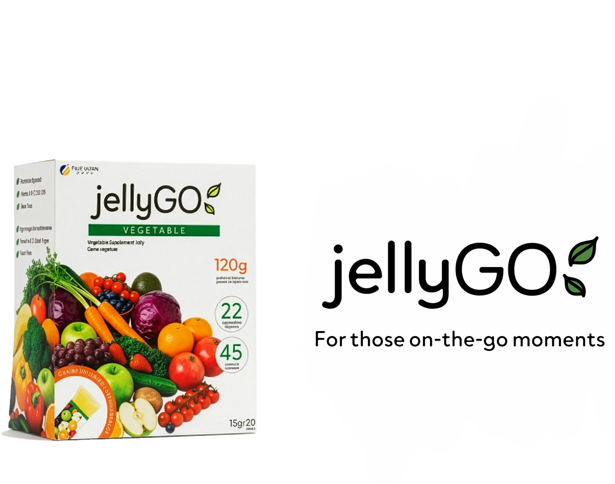
  • Experimented with a mascot, but ultimately decided with a word-mark logo that felt clean, modern and premium.
  • Utilized leaves as graphics, catering to branding seen on the original packaging.
logo-squure
logo-horizontal
logo-icon

packaging

OLD PACKAGING - KEY ISSUES

  • On store shelves, due to packaging failing to meet Canadian requirements, a white sticker placed overtop of the nutrition facts, covering strategic packaging elements
  • No English on packaging
  • Cluttered imagery and messaging for Western standards

KEY FIXES & FEATURES

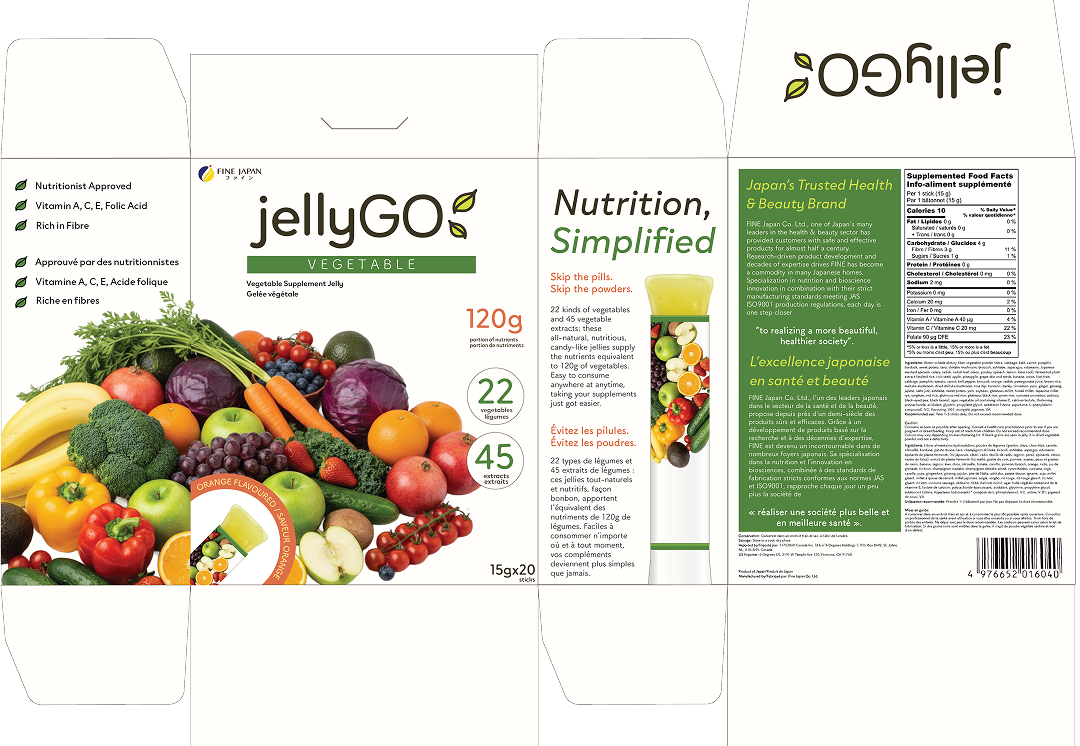
  • English & French Packaging
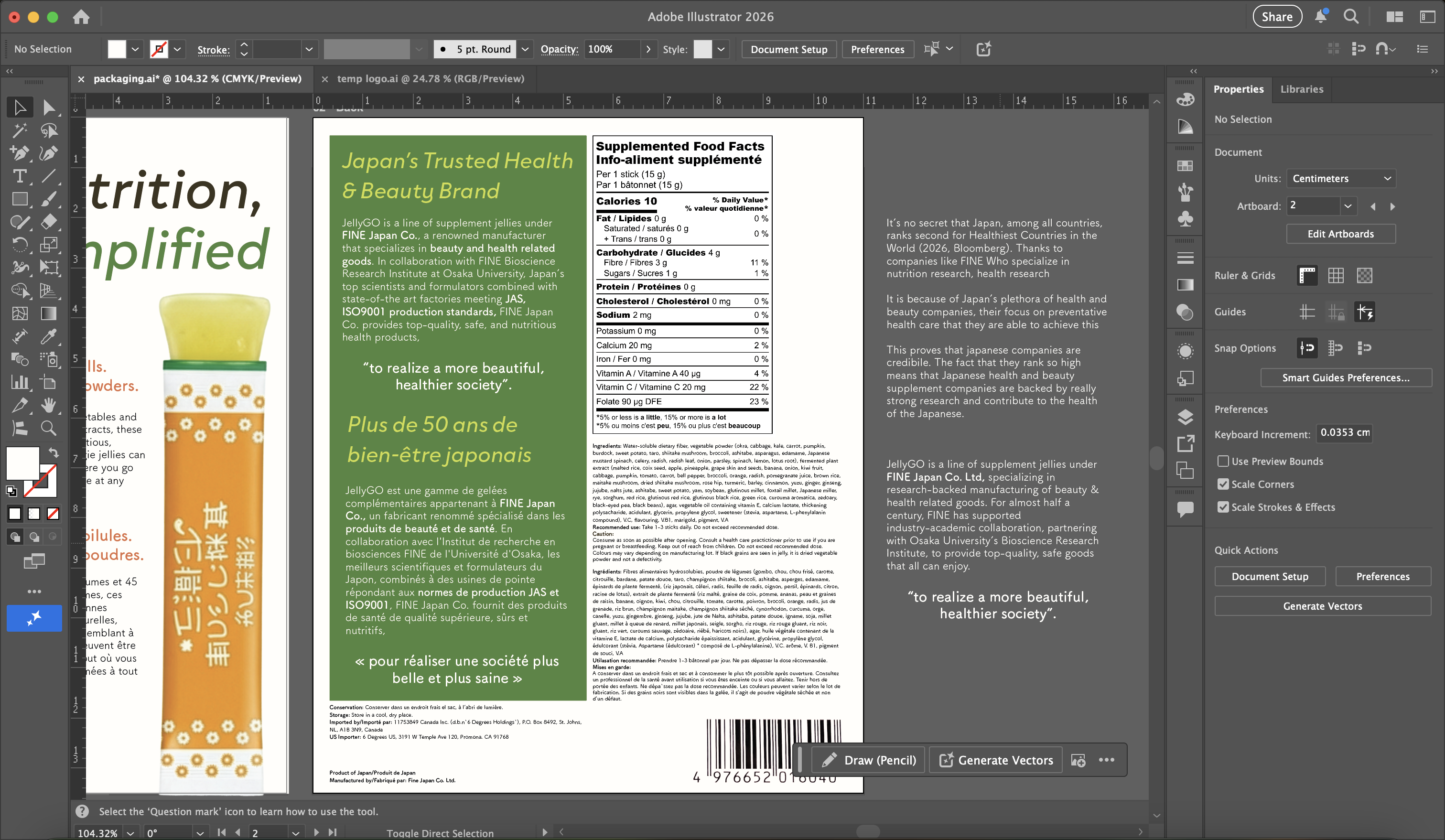
  • Label & nutrition facts up to CFIA standards
  • New Big Idea part of new packaging

PACKAGING DESIGN PROCESS

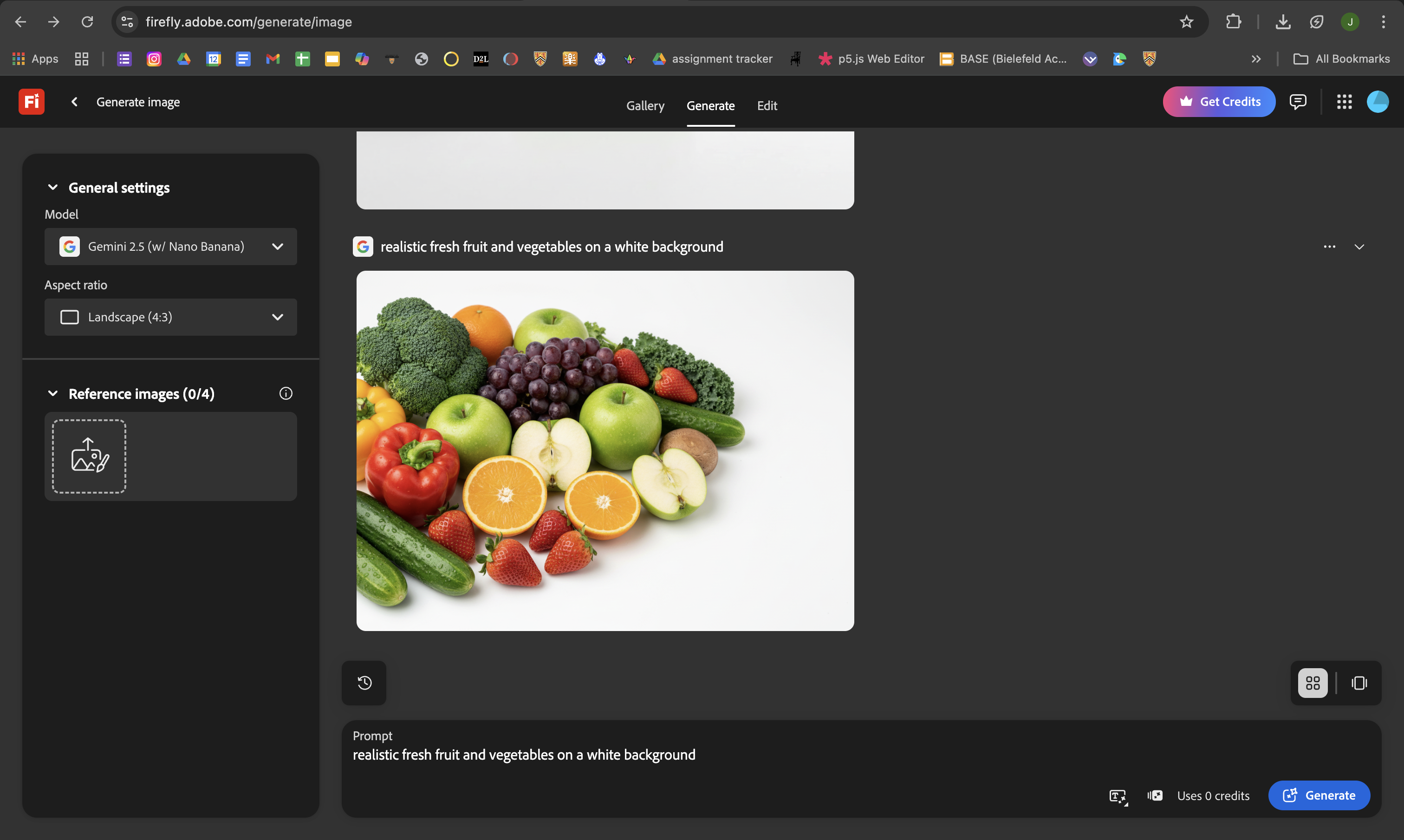
generate fruits with adobe firefly

Prompt: Realistic fresh fruit and vegetables on a white background

IMAGE GENERATION & DESIGN CHOICES

  • Used Adobe Firefly to generate a pile of fruit to use for the front of the box like the original package
  • In Japan, there are packaging regulations that state that only foods with 5-99% real fruit content can use imagery that display realistic looking fruits. Despite the product rebrand to be targeted towards Western audiences, I chose to maintain this aspect of the packaging continuing this messaging.
packaging wip 1
packaging wip 2

PACKAGING DESIGN & ASSEMBLY

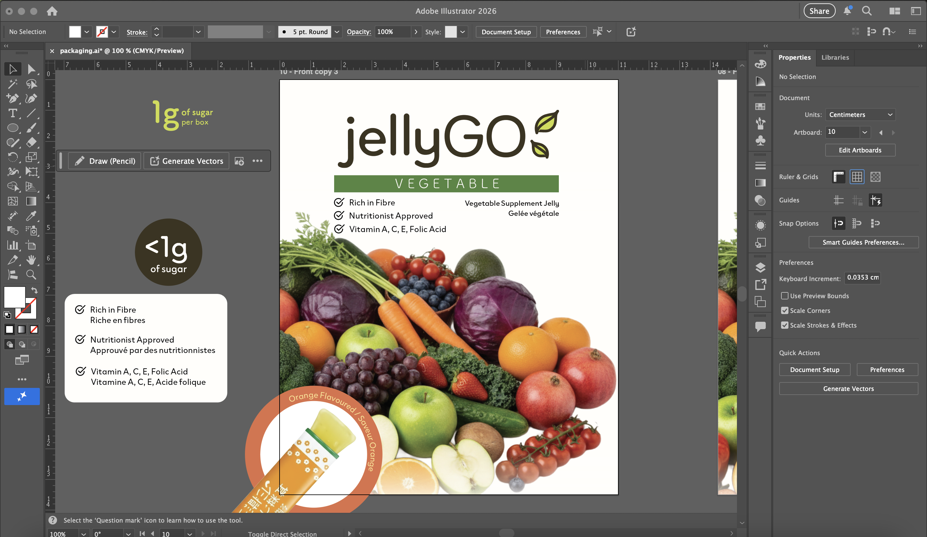
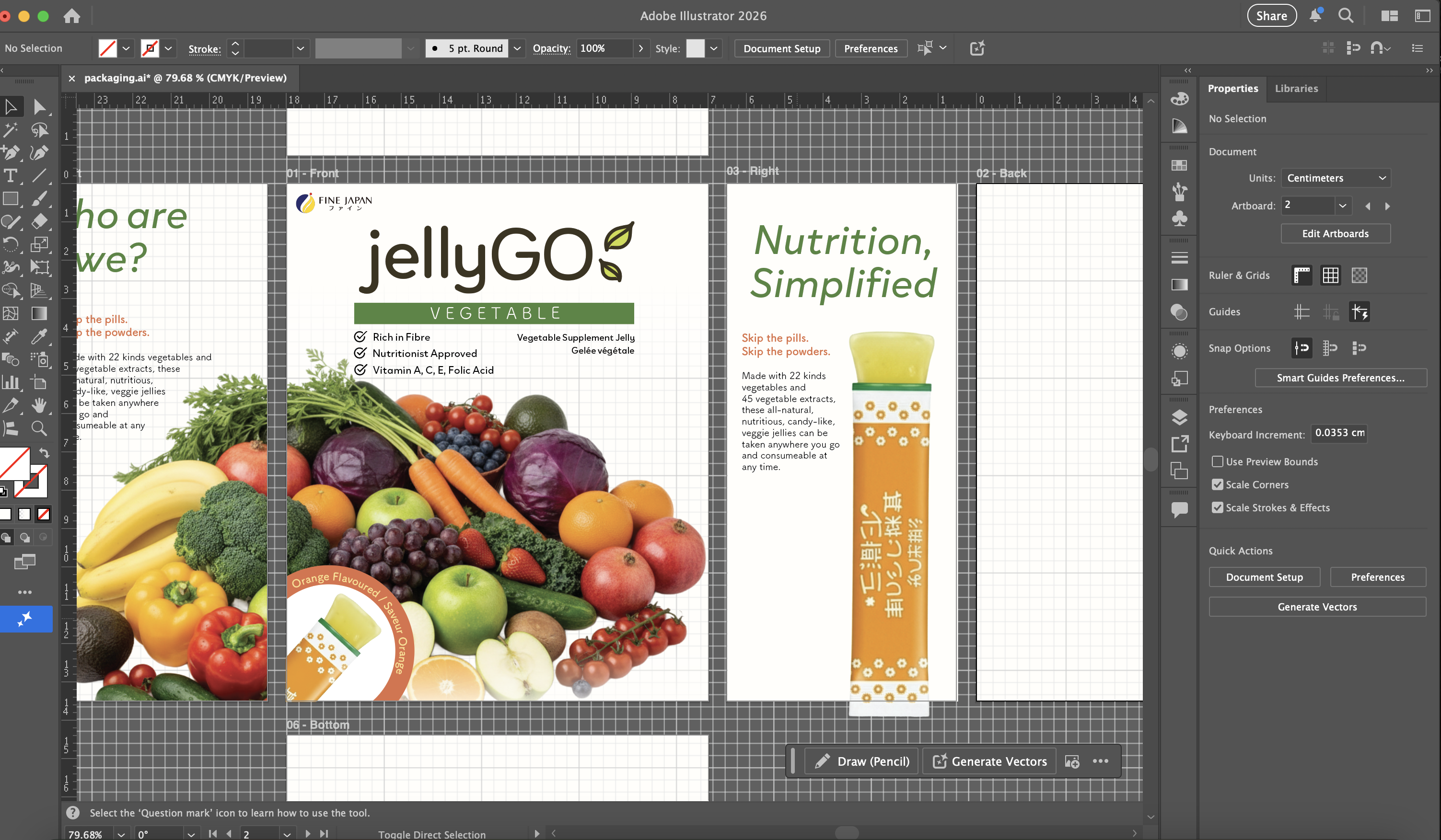
  • Created a box-net in Adobe Illustrator, and used the fruits as the main graphic on the front
  • Highlighted key features of the product in concise, easy to read bullet points
  • Utilized grids and guides for spacing
generate fruits with adobe firefly

FINISHING TOUCHES

  • Created a nutrition facts table online, cross-referencing information from the original website and nutrition facts label put onto the physical product in stores.
  • Experimented with messaging, first writing from my own ideas then using ChatGPT to make my writing clearer and concise.
  • Added French translations (as placeholder; used AI), and cross-checked packaging with CFIA health product regulations to ensure everything is up to standard.

packaging

"Shoot, I was rushing out the door and I forgot to take my supplements this morning"

"Crap, I didn't fill my pill organizer"

"Left my water bottle at home and water is $4... how do I take my supplements now..."

FORGET THE PILLS, FORGET THE WATER, AND
FORGET THE STRESS

Just stick a jelly into your bag. For those people who are busy and on the go, or those who simply just can't be bothered to be taking so many pills everyday. Everyone knows that health and beauty all starts from within, so why don't we make taking care of our health easy, delicious, and more convenient? Taking care of your body shouldn't have to be difficult.

SKIP THE PILLS

STAY ON TRACK

PROCESS

BRAINSTORM

What would make consumers choose this product over other supplement products?

  • People who have trouble swallowing or do not like pills
  • Consumers who regularly take supplements but takes significant effort to separate and remember to take them
  • Busy people who often forget to take their supplements, and remember at inconvenient moments
  • Convenience and ease to bring around
packaging wip 1
packaging wip 2

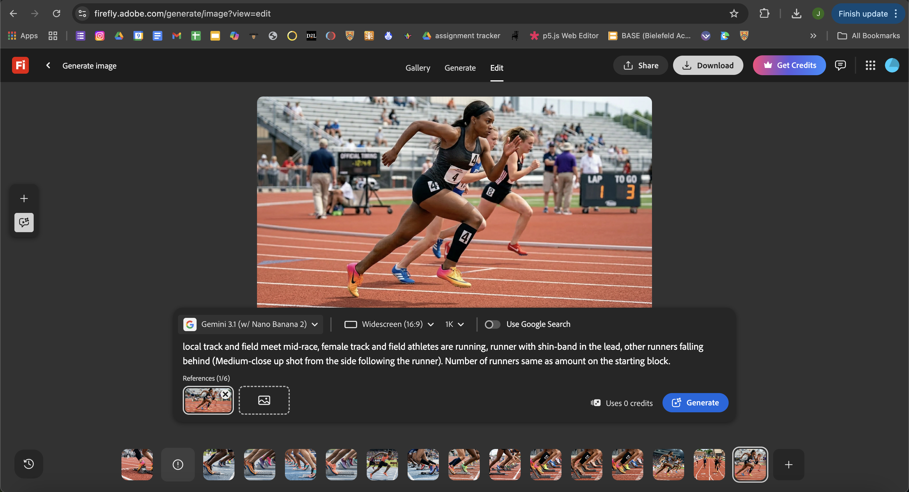
Prompt: local track and field meet mid-race, female track and field athletes are running, runner with shin-band in the lead, other runners falling behind (Medium-close up shot from the side following the runner). Number of runners same amount as on the starting block.

IDEATION AND FRAME GENERATION

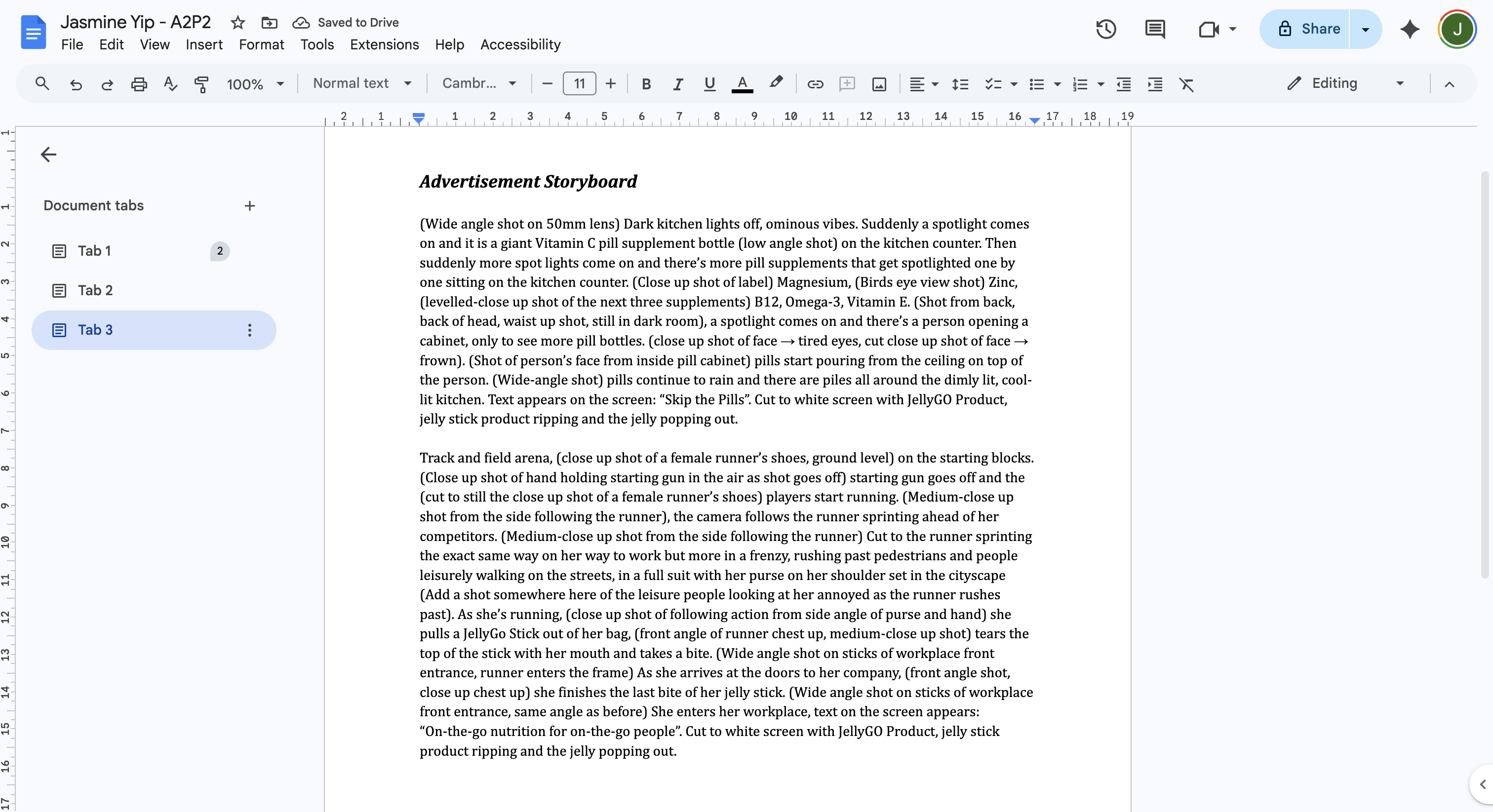
  • Wrote a frame-by-frame of my advertisement in a document, later modifying them to become AI prompts
  • In Adobe Firefly, generated images of each frame of the advertisement using the frame-by-frame prompts
packaging wip 1
packaging wip 2

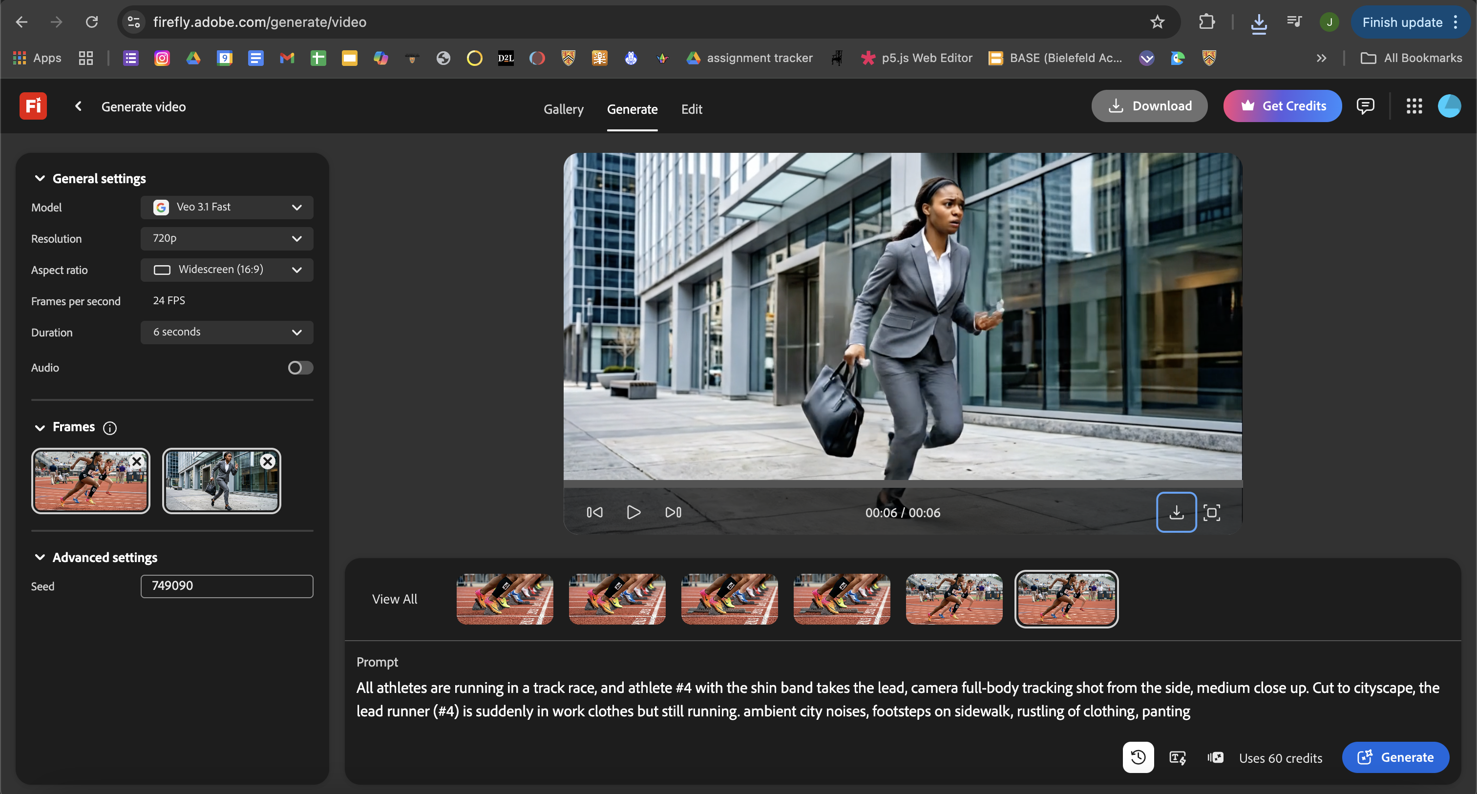
Prompt: All athletes are running in a track race, and athlete #4 with the shin band takes the lead, camera full-body tracking from the side, medium close-up. Cut to cityscape, the lead runner (#4) is suddenly in work clothes but still running. Ambient city noises, footsteps on sidewalk, rustling of clothes, panting.

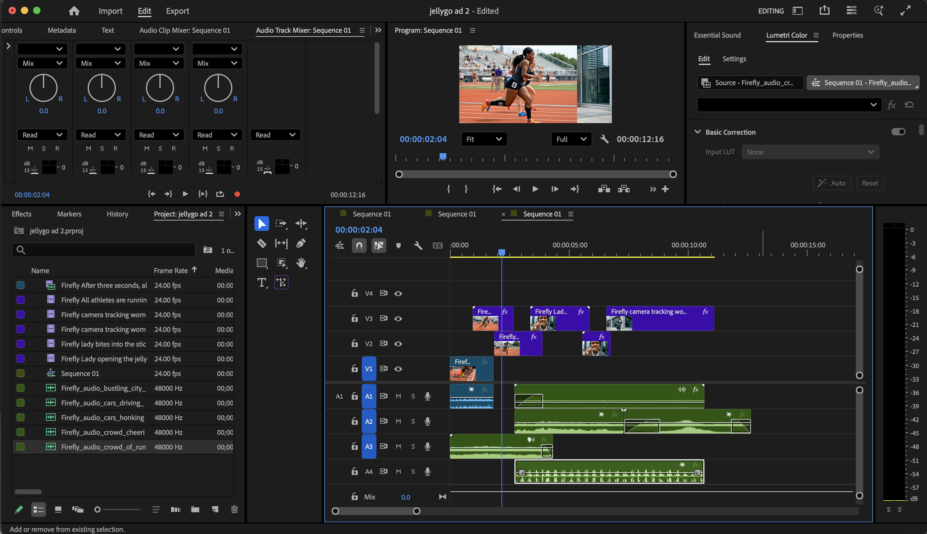
VIDEO GENERATION AND EDITING

  • Used Adobe Firefly's Generate Video feature, using the generated frames as the beginning and end scene, and letting the AI create short, several second videos.
  • Put together the generated videos in Adobe Premiere Pro and Adobe After Effects
packaging wip 1
packaging wip 2

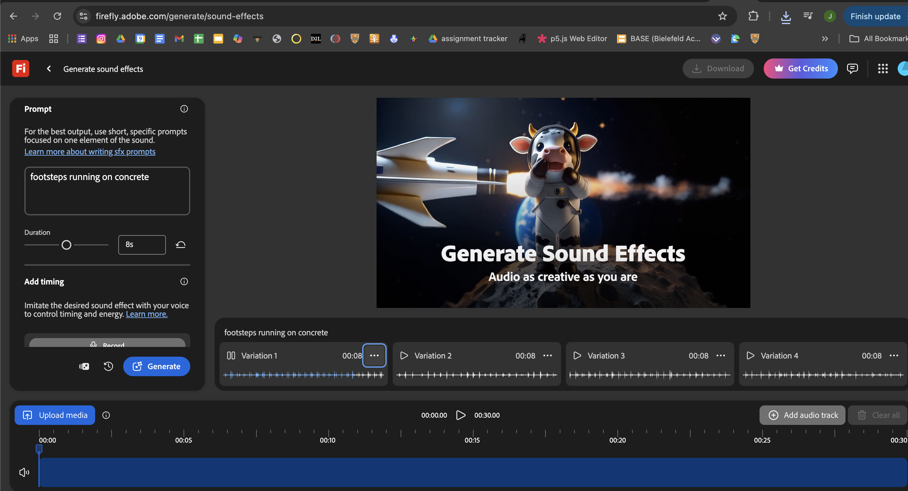
Prompt: footsteps running on concrete

FINISHING TOUCHES

  • Used Adobe Firefly's Generate Audio feature to generate pick-up sounds for the advertisement
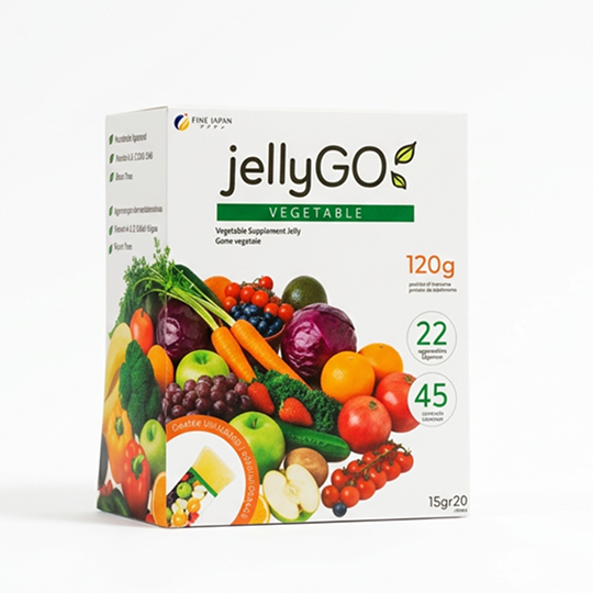
  • Used a combination of Adobe Premiere Pro, Adobe After Effects, and Adobe Express to add elements such as text and transitions.

conclusion

new packaging folded

REFLECTION

If this were to be a real rebrand project for this company, I wonder if the new logo, product name, and imagery feels too disconnected from the original product. As a stand-alone product, I think the rebrand was successful design-wise, catering to Western design trends, translating and updating messaging to consumers, however I wonder if I could have done better following the company's current design and branding, or created a product more similar to the existing packaging. I think the key aspect I was missing in this redesign was making the English-version and the Japanese-version still feel like they are the same product from the same line and company. If I were to redo this project, I would try to adapt the design for foreign markets while better following existing design and branding.