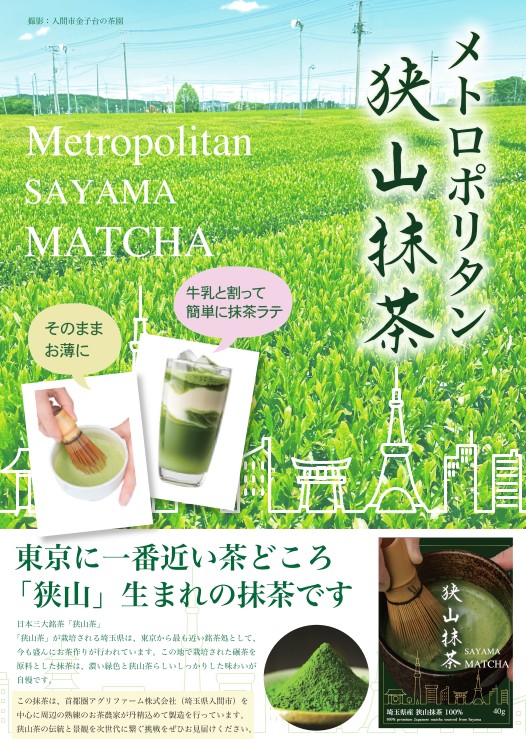
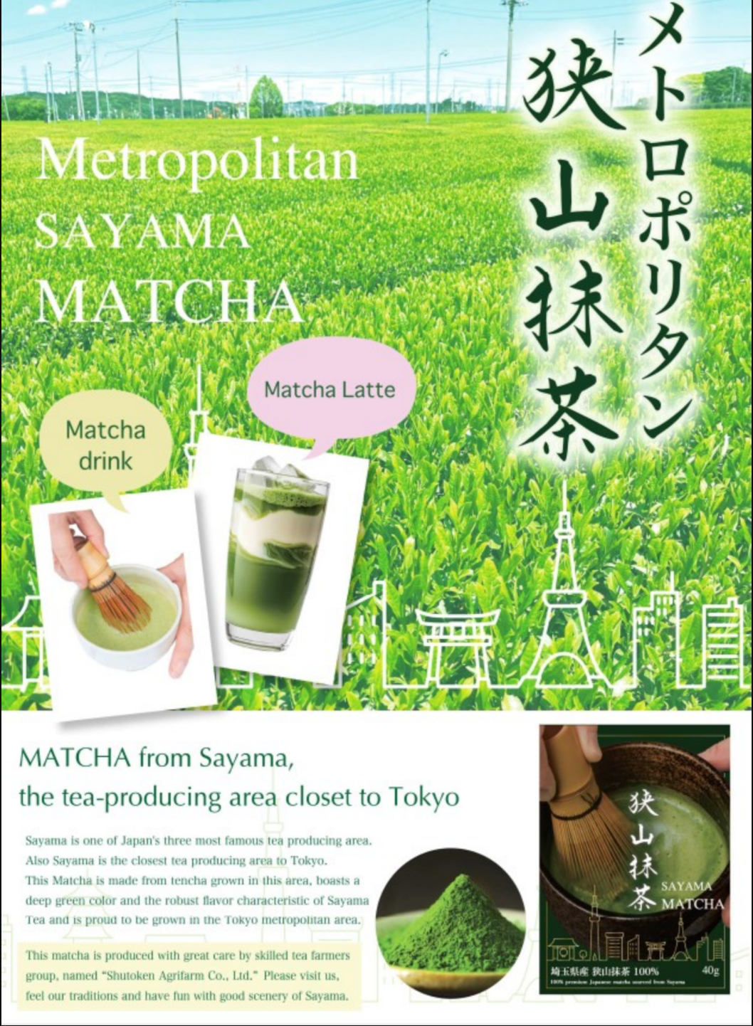
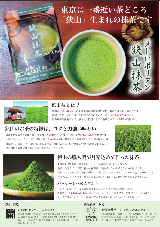
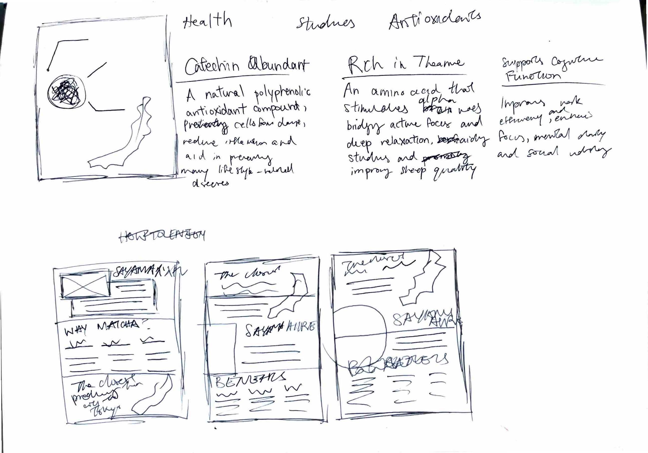
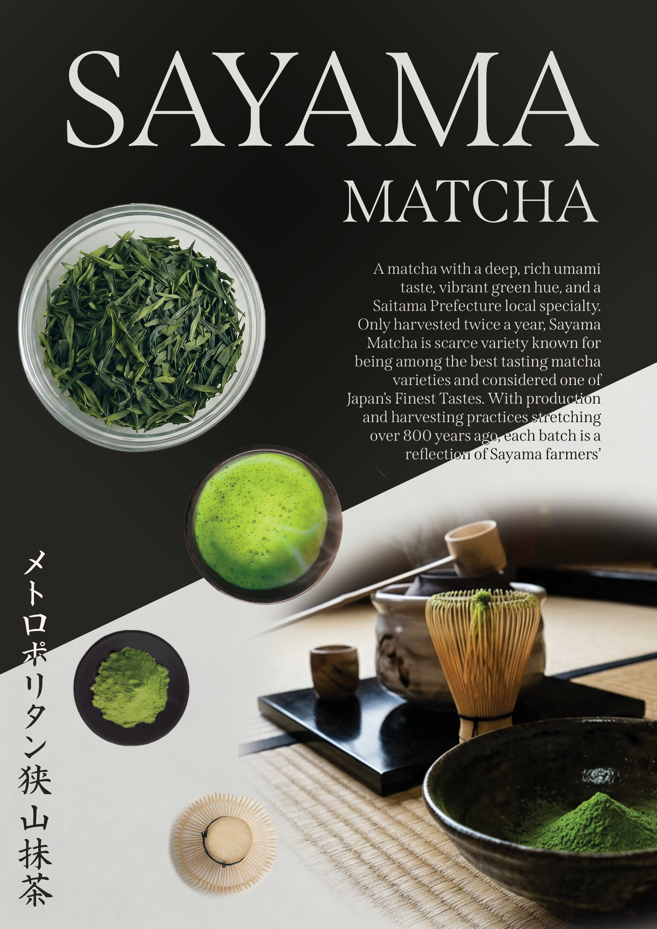
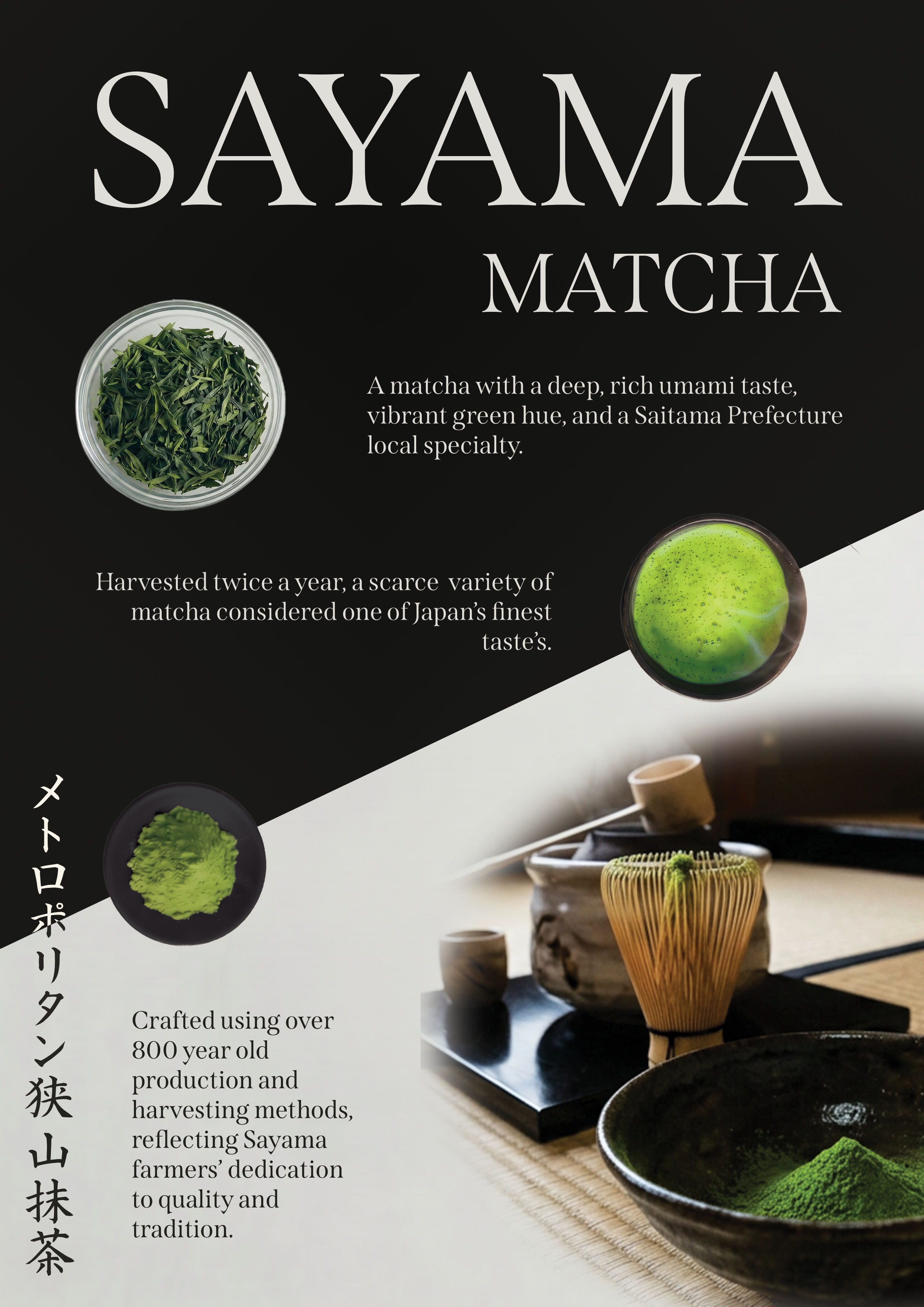
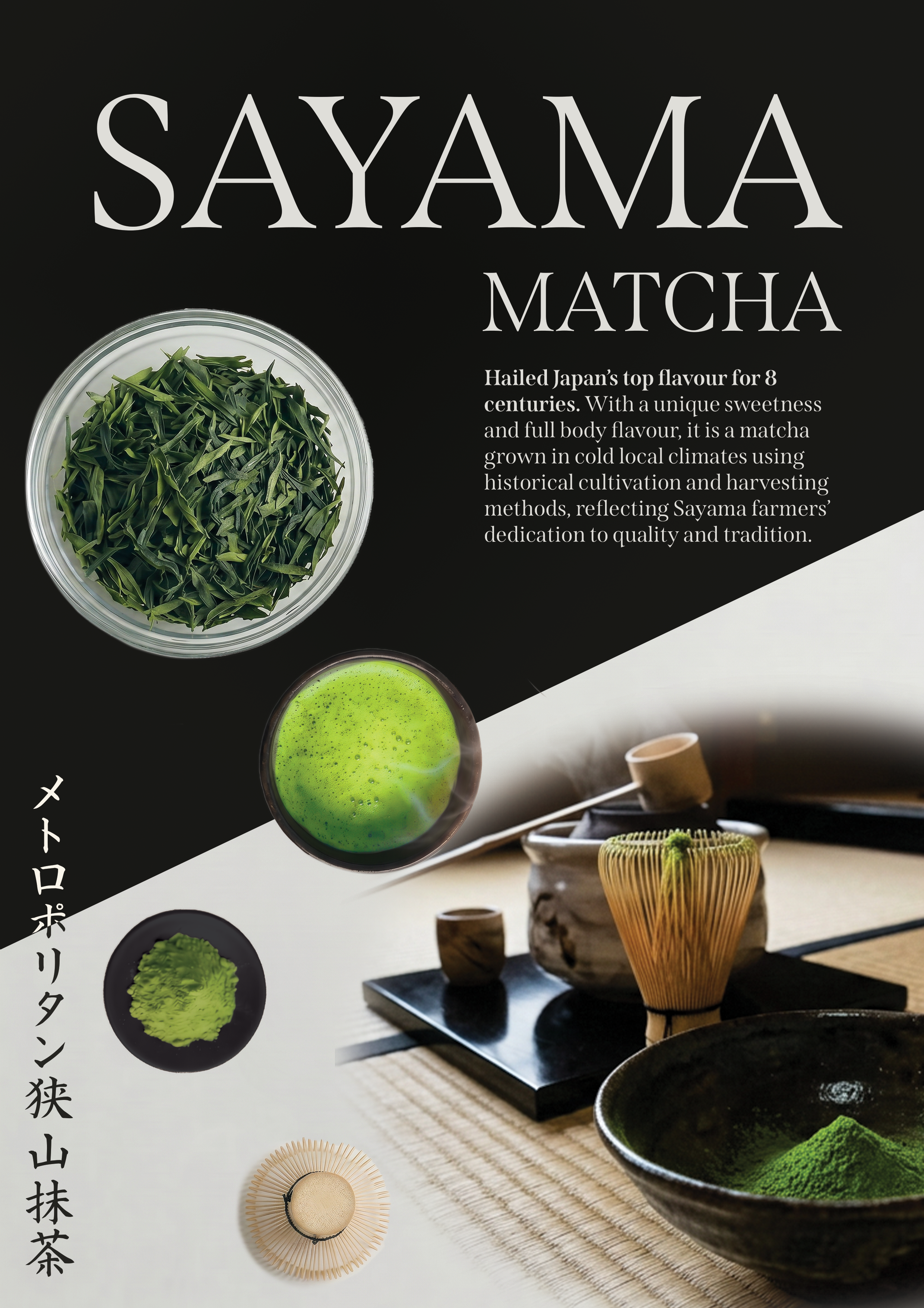
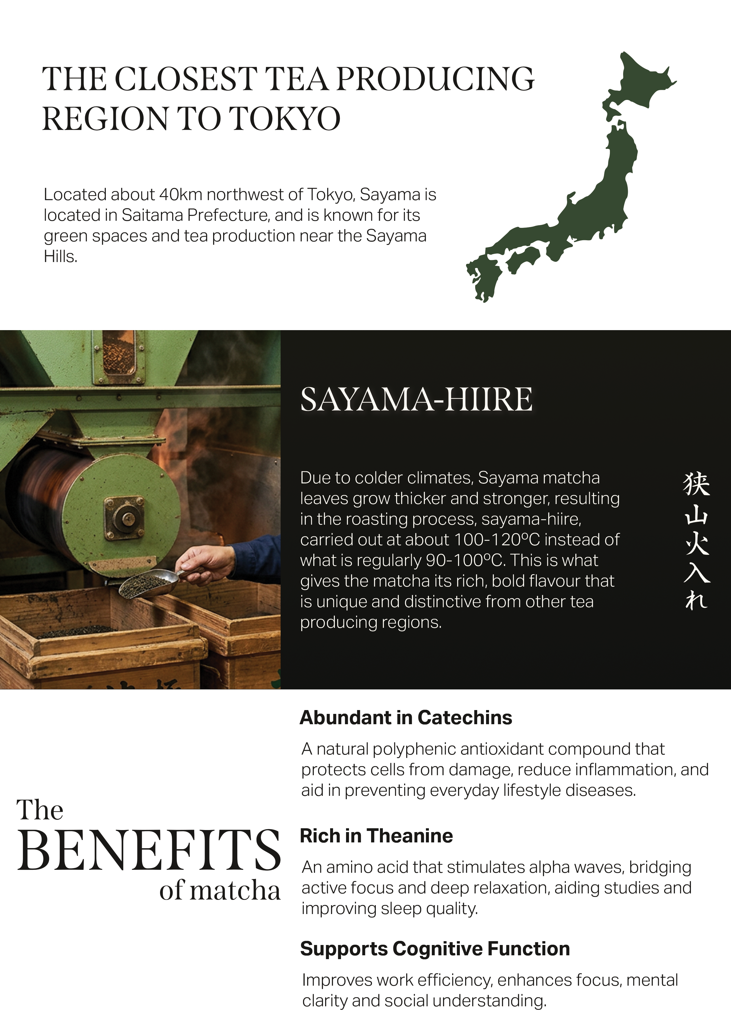
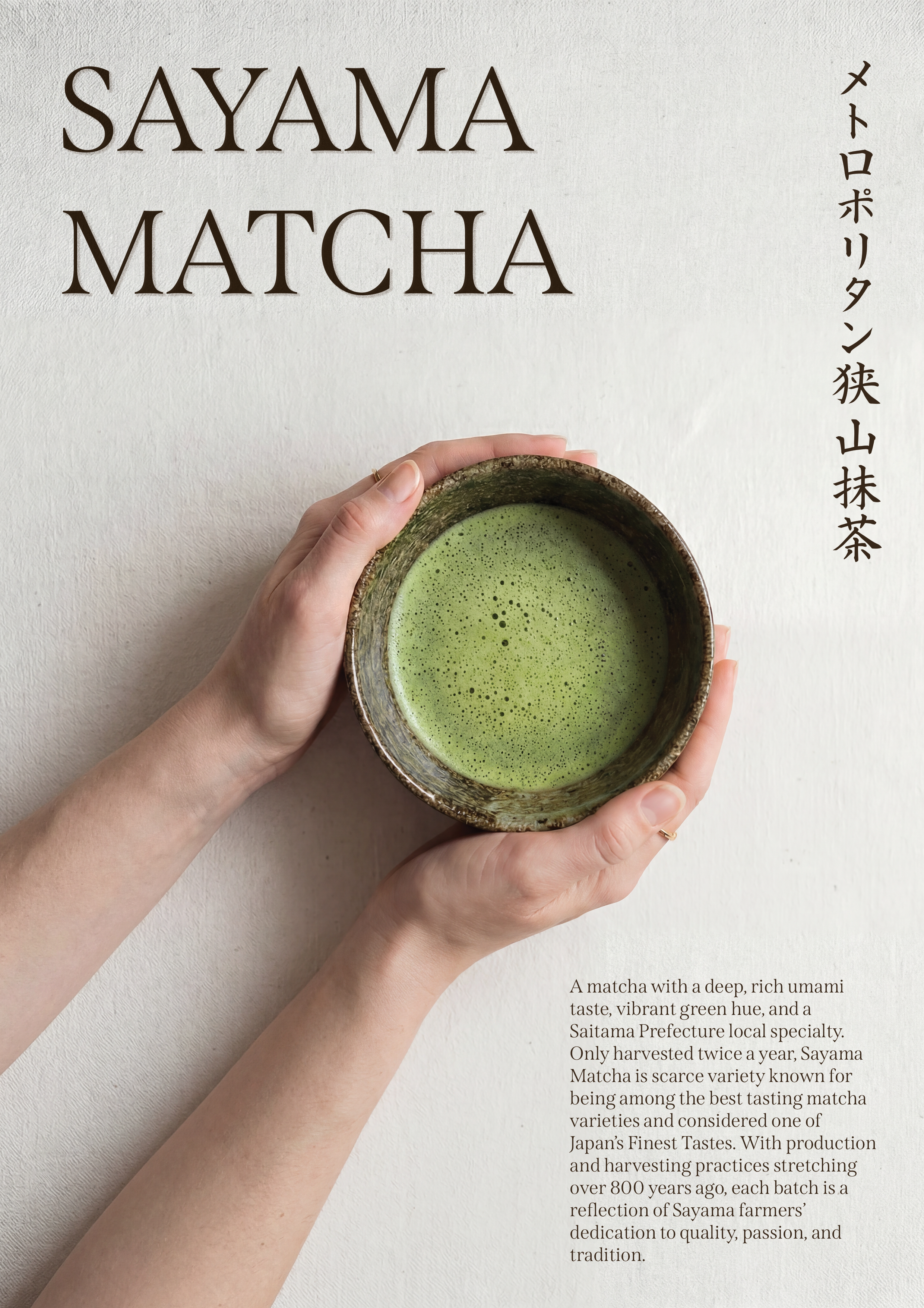
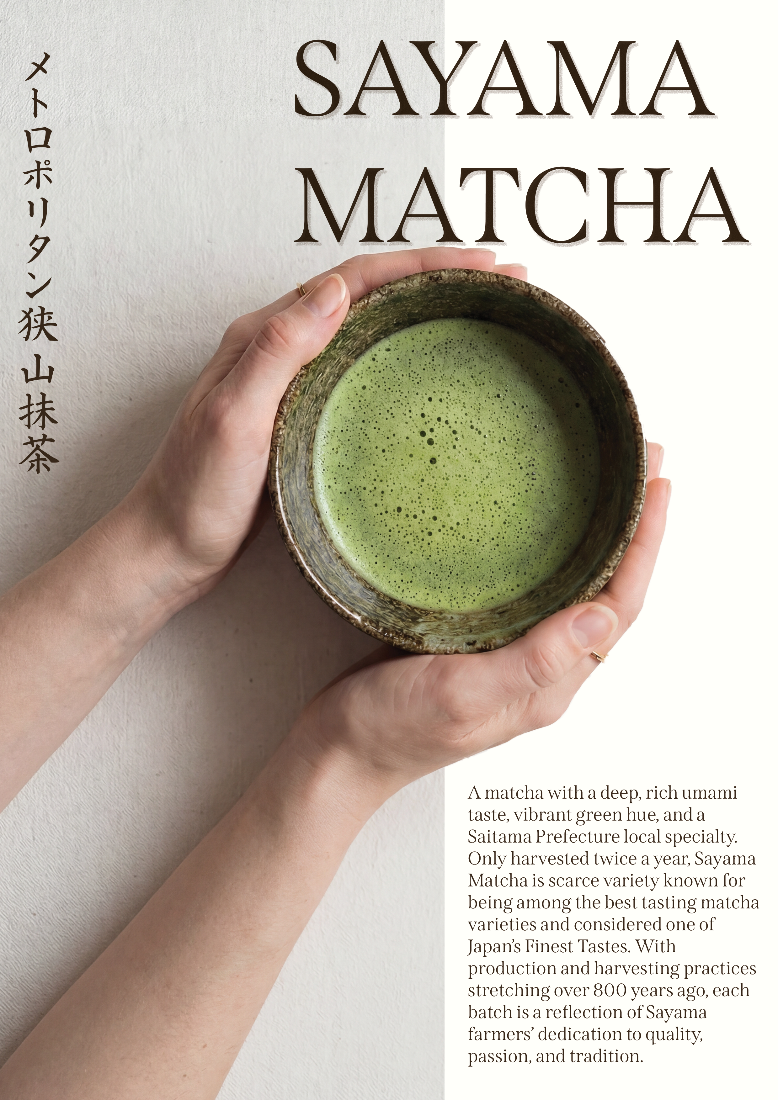
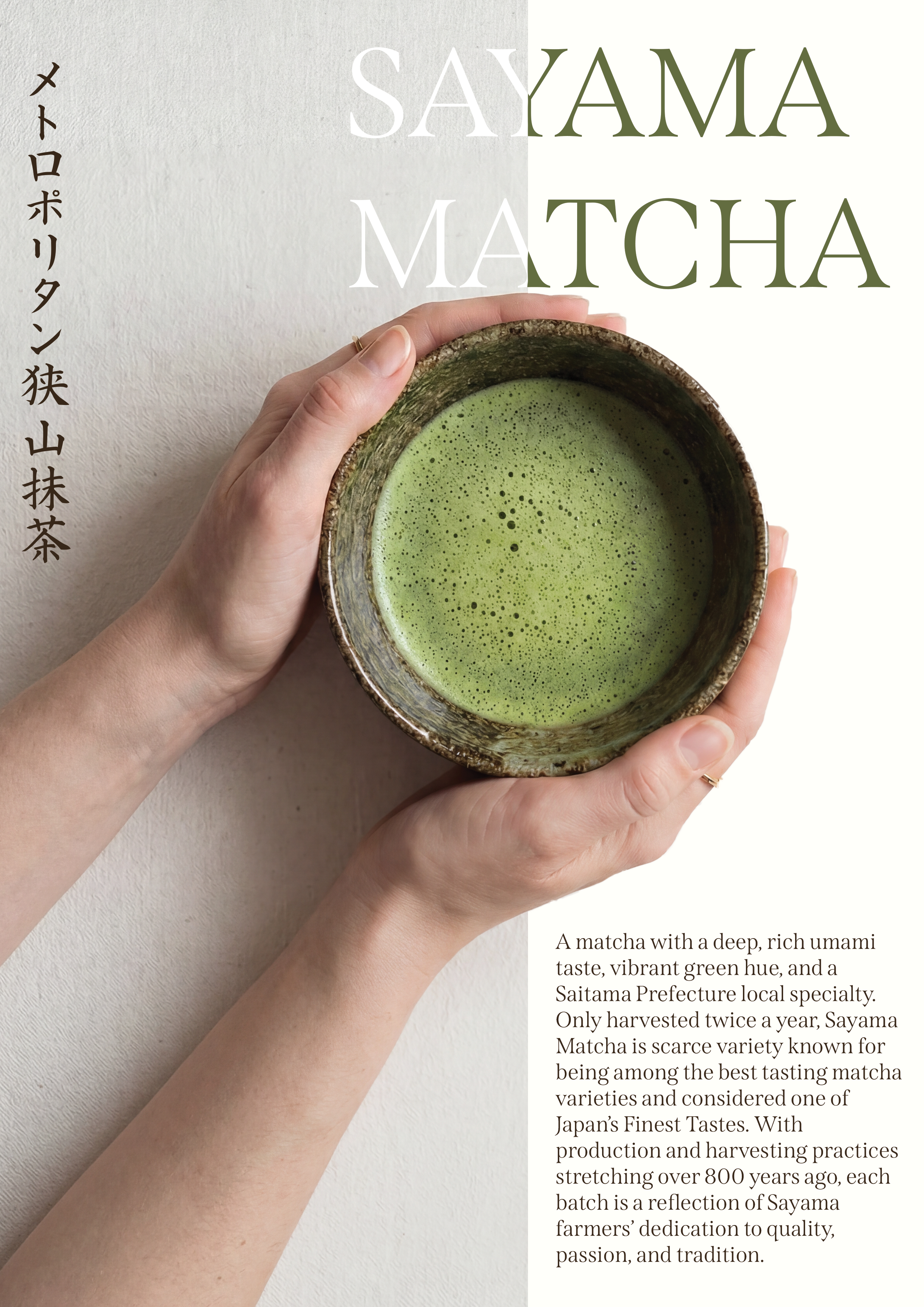
sayama matcha poster frontside sayama matcha poster backside

design process

step 1 - research

PREVIOUS FLYERS

RESEARCH

Region & Production Environment

  • Grown in Sayama, located in Saitama Prefecture, one of Japan's three major tea regions alongside Uji and Shizuoka
  • Closest major matcha-producing region to Tokyo
  • Cultivated in the Sayama Hills with long, cold winters
  • Cold climate slows leaf growth → higher concentration of flavour
  • Tea plants are bred for thicker, more resilient leaves

Production Methods & Rarity

  • Uses traditional 手もみ製法 (Te-momi-seihō) → hand-rolling technique over 800 years old
  • Each production step takes ~3x longer than standard methods
  • Finished with Sayama-Hiire roasting → enhances aroma and depth
  • Harvested only twice per year → limited supply
  • Represents ~2% of total matcha production
  • Strict regional standards (100% Sayama-grown leaves) increase exclusivity
  • Not mass-produced → maintains artisanal quality

Taste, Quality & Positioning

  • Bold, full-bodied flavour with deep umami and subtle sweetness
  • Known for a vivid, striking green colour
  • Distinct roasted aroma and smooth yet intense finish
  • Considered among “Japan's finest tasting” matcha varieties
  • Less globally known compared to Uji and Shizuoka teas
  • Positioned as a premium, niche product for dedicated matcha enthusiasts
  • Reflects the region's tradition, craftsmanship, and farmer dedication

step 2 - vision + planning

VISION BOARD

SKETCHES

poster sketch 1

Front page

  • Main characteristics to convey
  • Rough layouts sketched
poster sketch 2

Back page:

  • Rough layouts sketched before using vision board
poster sketch 3

Front page

  • Rough layouts sketched using inspiration from vision board
poster sketch 4

Front page

  • More rough layouts sketched using inspiration from vision board
poster sketch 5

Back page

  • Rough layouts + planning details of messaging

step 3 - design

PRELIMINARY FRONT PAGE DESIGNS

Preliminary front page designs presented to the client. Intended to better understand the vibe wanted for the poster and influence the design of the back page through feedback.

Sayama Matcha Poster v4.1 Sayama Matcha Poster v4.2
Sayama Matcha Poster v4.3 Sayama Matcha Poster v4.4
Sayama Matcha Poster v1.1 Sayama Matcha Poster v1.2
Sayama Matcha Poster v3
Sayama Matcha Poster v5

I created 3 sets of posters with different styles, communicating different characteristics of the tea. While the first set feels more modern and simplistic, the second set feels more luxury and elegant. The last set feels more authentic and traditional. In the end, the client chose the style of Set 3.

REVISIONS

Sayama Matcha Poster v5.2

REVISION 1

To enhance visibility, condensed text to remove the inverse colour effect.

Sayama Matcha Poster v5.3

REVISION 2

The client requested I maintain the original layout, so I kept the same messaging while removing the inverse-colour by condensing the text.

Sayama Matcha Poster v5.3

REVISION 3

I condensed the Japanese title of the poster to avoid the text bleeding into the dark background of the poster. In addition, I decided to change the font of the paragraph text to a sans-serif font to avoid clashing with the serif title font.

Sayama Matcha Poster v5.5

FINAL

Client requested the Japanese title to be adjusted to match the English title, so I opted for a Mincho font.

PRELIMINARY BACK PAGE DESIGN

Sayama Back Page v1

DRAFT 1

The back page was dedicated to be an in-depth explanation of Sayama matcha, its processes, and benefits, therefore breaking down the process into three sections. I maintained some of the information conveyed on the original posters while adjusting the wording and layouts for English audiences.

REVISIONS

Sayama Matcha Poster Back v4.1

REVISION 1

Messaging and information change

Sayama Matcha Poster Back v4.2

FINAL

Alignment fixes + return to 3 section division.

sayama matcha poster frontside sayama matcha poster backside